What makes a good business logo
There are a lot of great logos, but sometimes, very important pieces are missing before it’s a successful logo.
Think of a pizza! Have you ever tasted a pizza and felt like something was missing? You couldn’t really point your finger at a specific part but all you could think was “This pizza isn’t that great” but why?
Think of a logo, just the first that comes to mind….what logo did you think of? You might have thought of something like Coca Cola, Amazon or McDonald’s, do you know why?
What do they all have in common? What makes their logo so famous?
After reading this blog you will know the secrets you need, to create a successful logo.
Simple
A good logo needs to be easy to recognise with a simple design and the design needs to symbolize the brand’s messages.
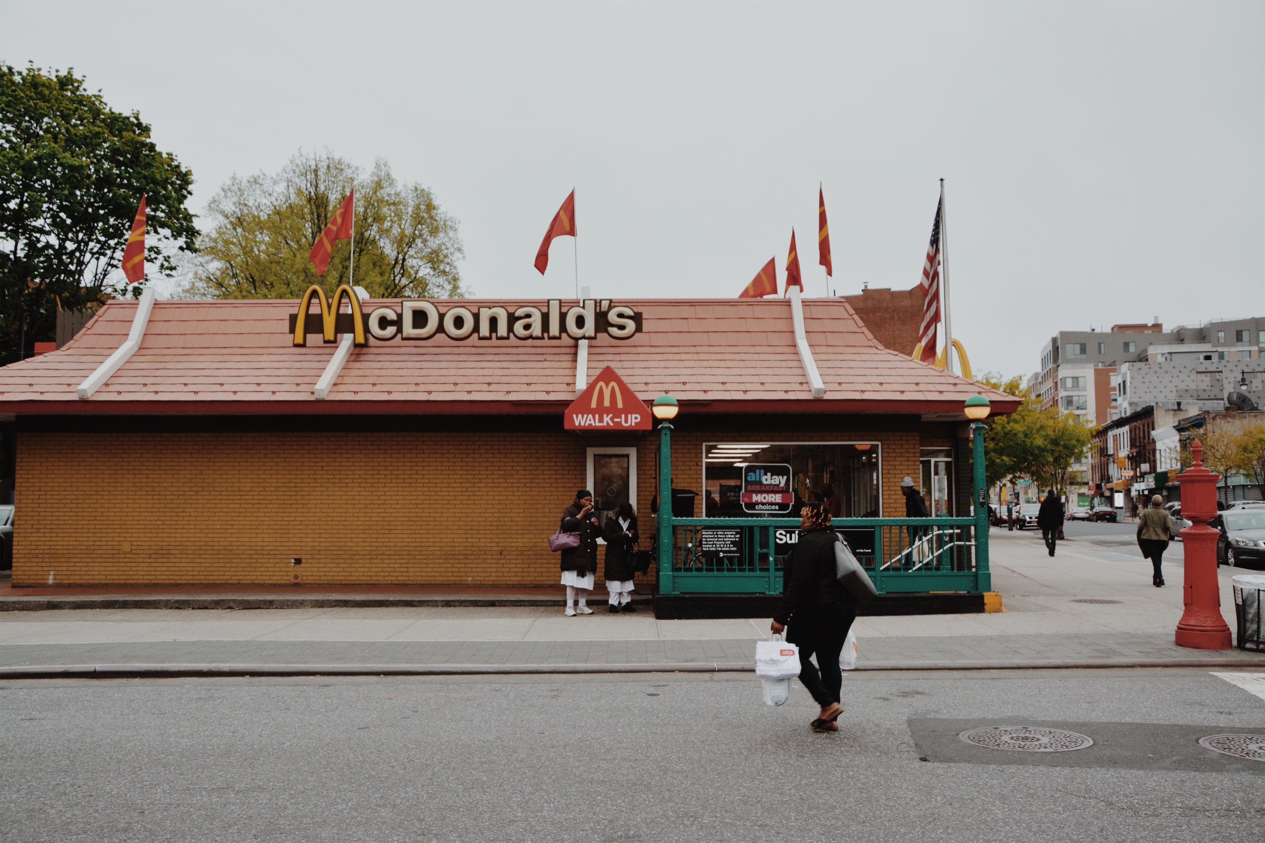
Here is an example “McDonald’s” “M” it’s simple, the shape is the symbol of the arches
that were part of the design of the building of the first restaurant in 1952.
It’s unique, because they managed to keep the shape of the logo, from the first restaurant,
that is pretty amazing, don’t you think?
When your logo is simple, the brain recognizes it instantly and the logo can be processed faster by the human eye, as a result your clients will remember you and return.
That is why the logo is often called “The face of the company”
Do you agree with that?
Meaning of your logo
Let’s stay with the McDonald’s logo since it’s a logo we all know well. What does it represent? It’s just an “M” it doesn’t represent very much, or does it?
You won’t find many logos with a simple meaning, you can always go deeper (if it’s a great
logo, of course.) and you can keep analysing them.
So, back to the “M”, it’s the first letter of McDonald’s and that was Patrick*s last name. He
opened the first drive-through back in 1937. Did you notice that the shape also looks like two fries bent into an “M”? Did I make you hungry?
Okay…Let’s quickly talk about the Nike logo (also known as the Swoosh.) it is of course super simple but still, it has so much positive energy, it almost looks as if the logo
is moving!
You can feel the motion and the speed, and it’s all created by the shape of the logo, therefore it’s perfect for a sports logo.
The Nike logo is a good example on a very simple yet successful logo. Don’t spend too
much time being abstract with your design if it has no point in the messages you want to give.
The color
The color of McDonald’s logo is yellow and red, do you know why?
If your answer is “because red and yellow is super nice colors!” then please look around you, find a chair and then hit yourself in the head with it, till you say “Sorry!”
(I’m just kidding!)
You will never get a call from your designer saying “Okay, I just need to add some colors, what is your favourite?” you must always think deeper when it comes to design.
How can you find a color that represents the/your business?
E.g. red and yellow together has a psychological effect on us. When we see it our heart rate
increases, it makes us happy and we instantly think of food.
If that isn’t fascinating, then I do not know what is! We could, of course, go deeper into details as color is a huge topic in design and has tons of meanings
check out this article about color psychology in logo design & branding.
However, it is important, that a good logo looks great in black/white as well.
If your logo has color (most logos do.) look at it in black/white and see if it’s as amazing.
The logo should give old as well as new clients emotions and instincts from the different colors, but it shouldn’t dominate the design.
Conclusion
If we go back to the beginning and imagine the logo as a Pizza. You now understand that it
isn’t enough to make it beautiful. You cannot serve the pizza with amazing crust only.
You must make sure the mozzarella is great, the tomatoes have the right color and the
pizza has the correct shape.
To make a successful pizza, make it unique, otherwise, what is the point of eating your pizza?
Your clients will not remember your pizza for the crust if that’s the only thing that was
amazing.
Your pizza, well…logo, is the image of your business, so make it amazing!